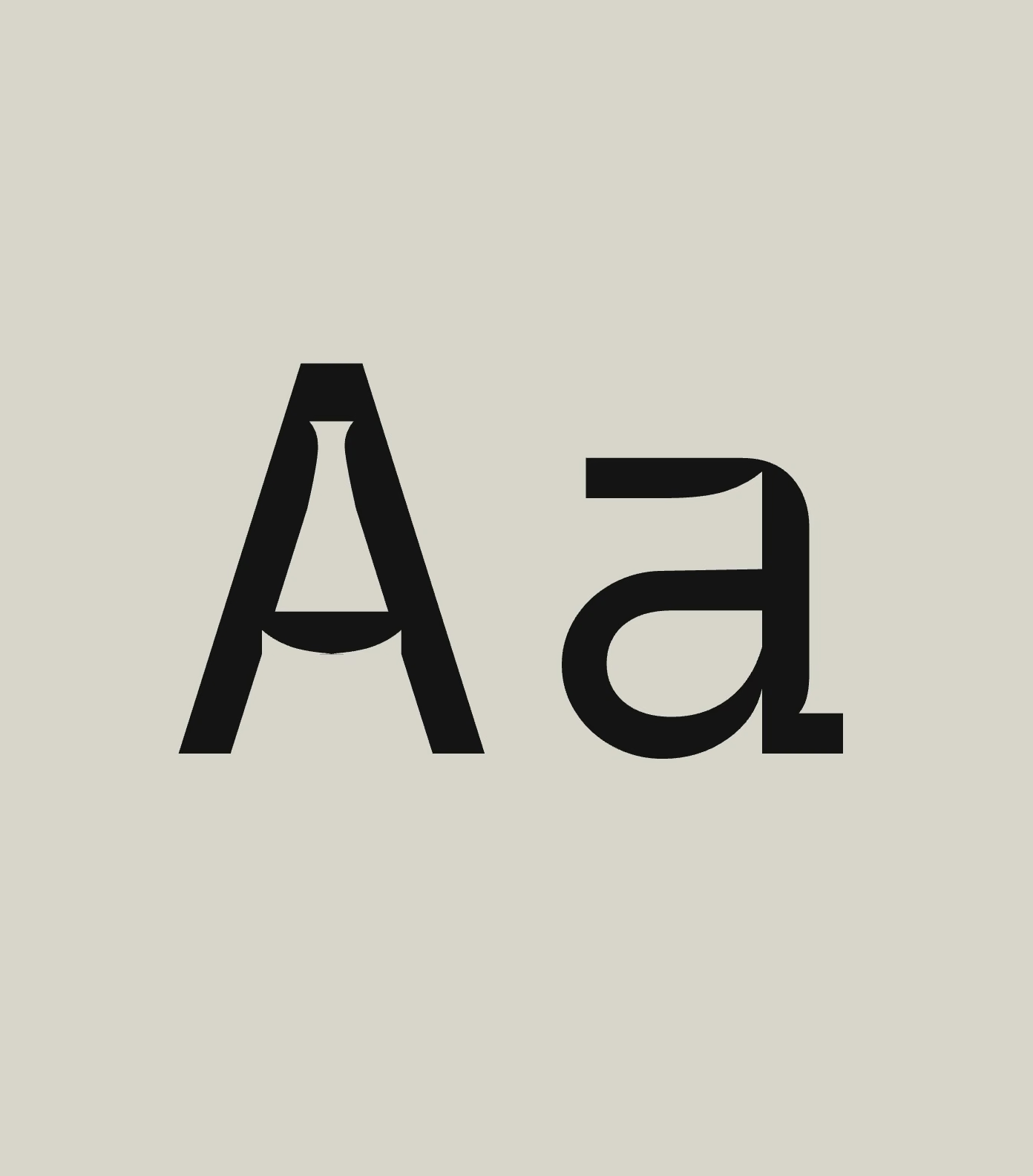
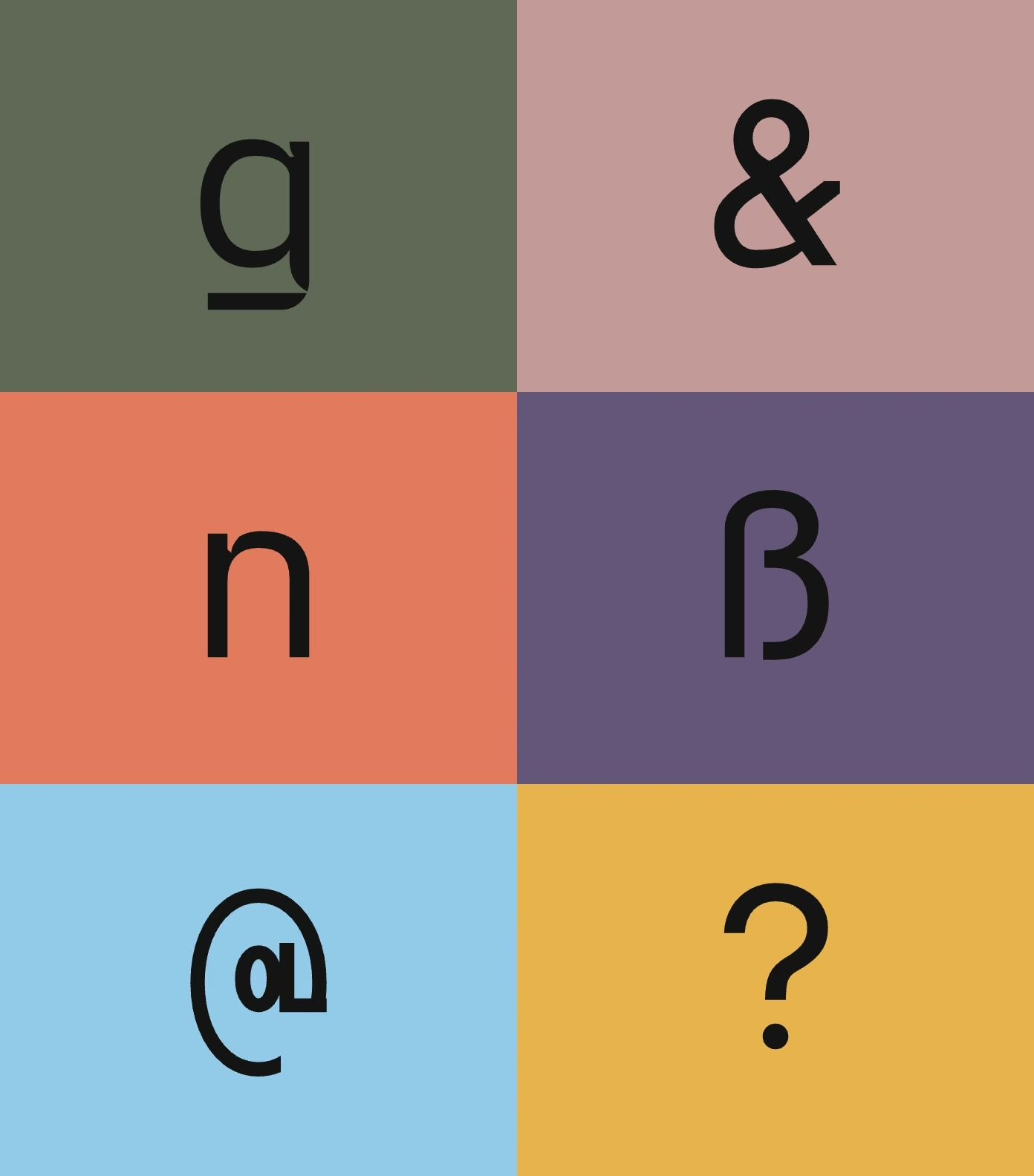
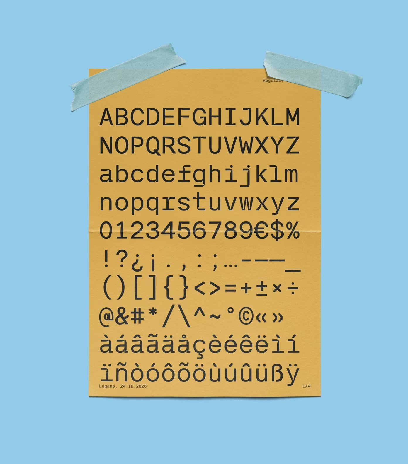
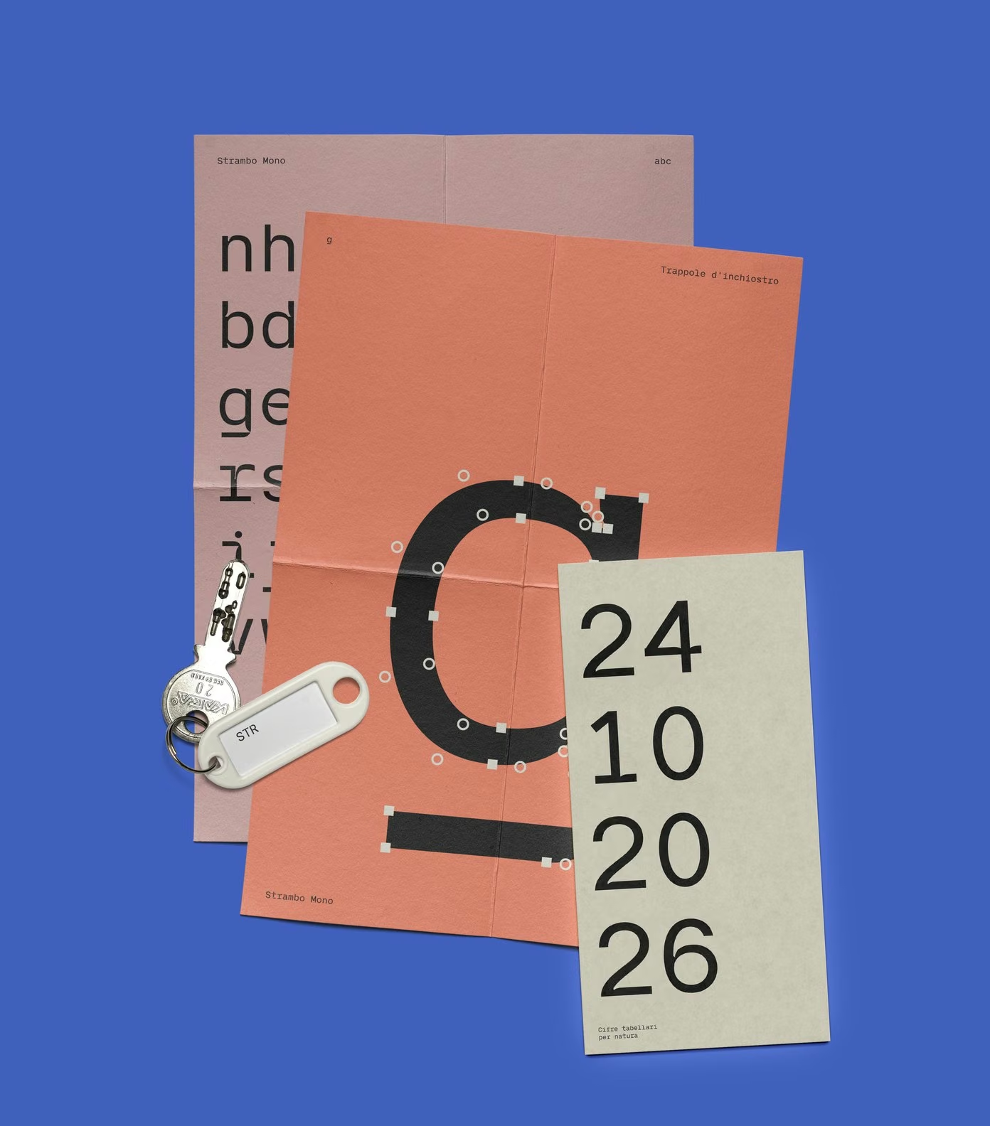
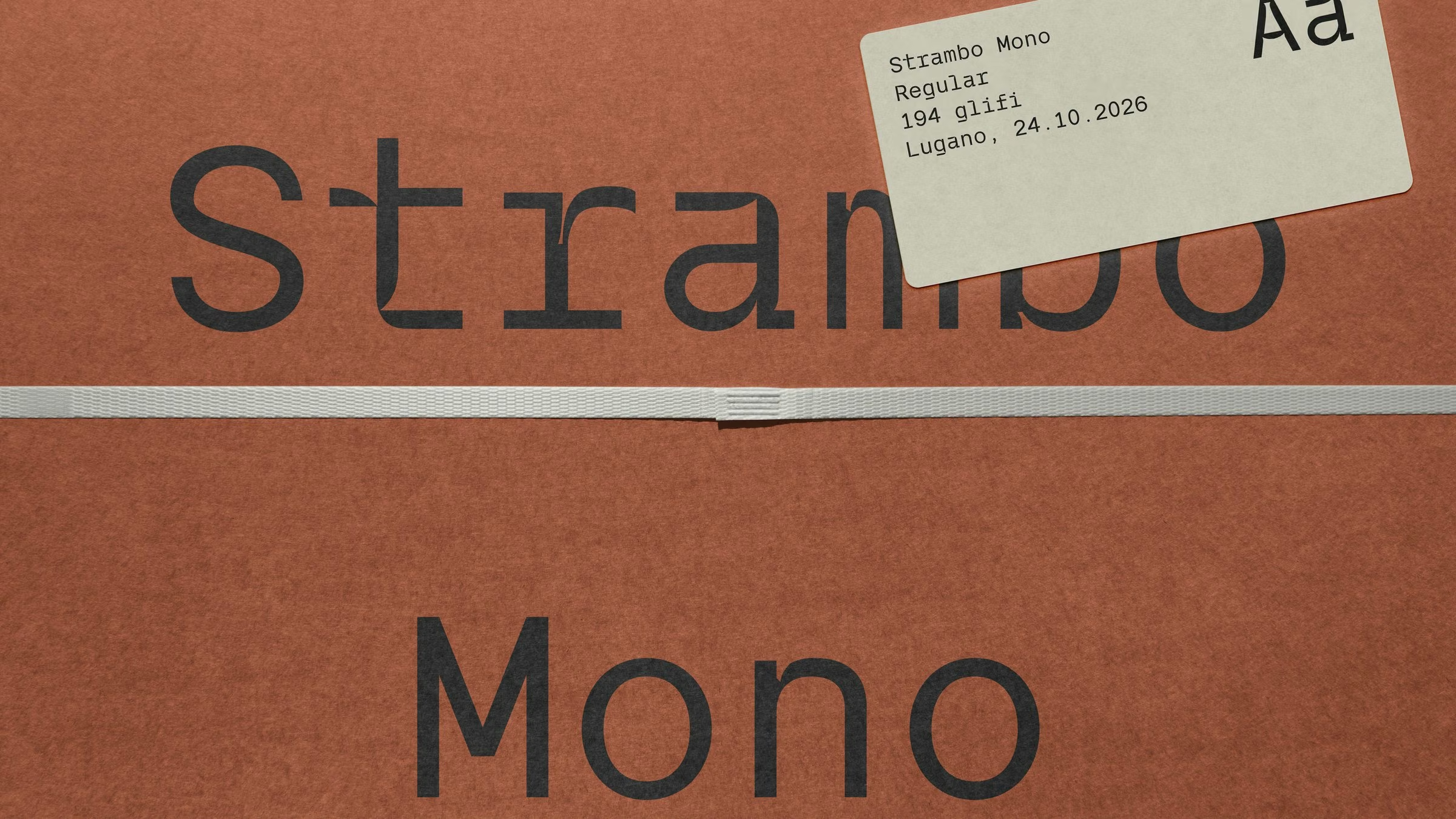
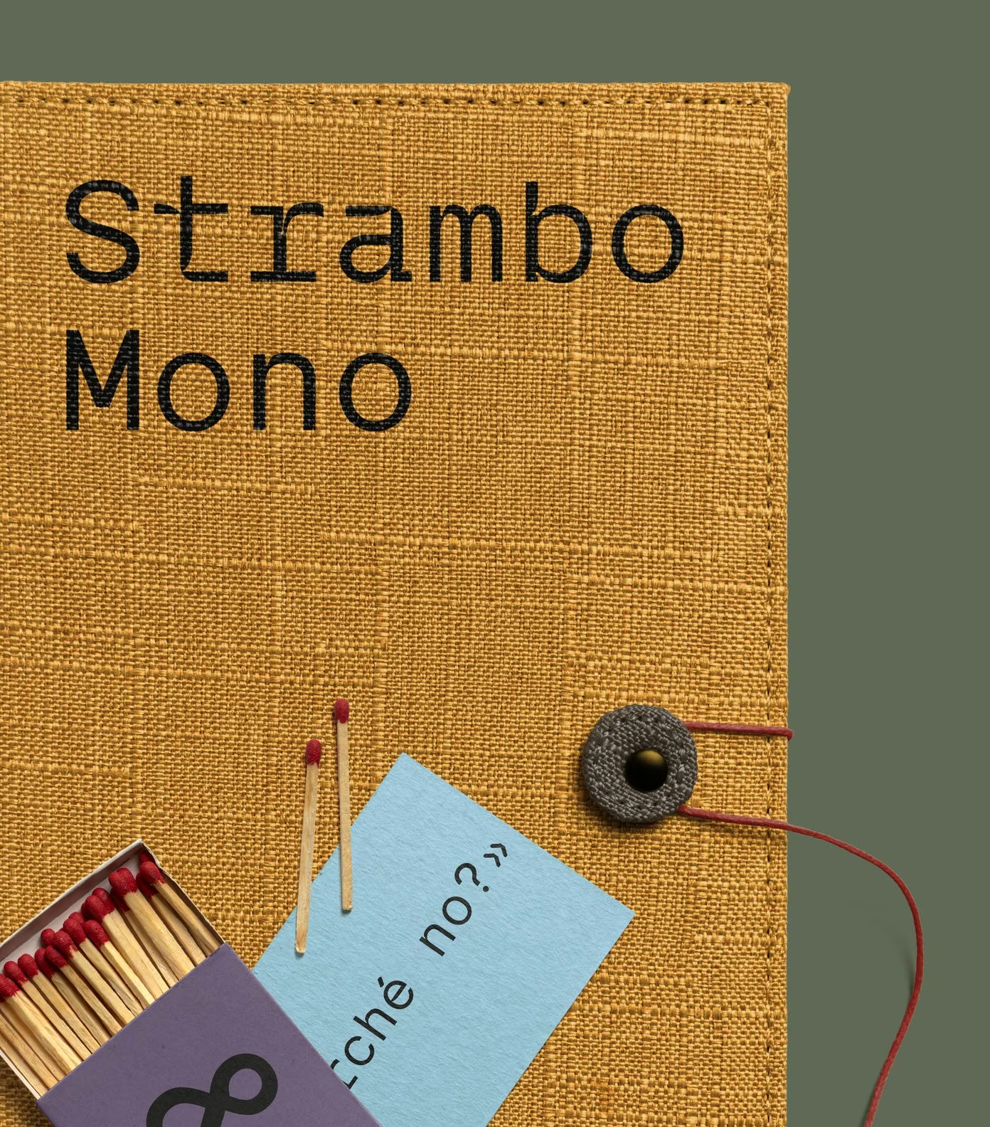
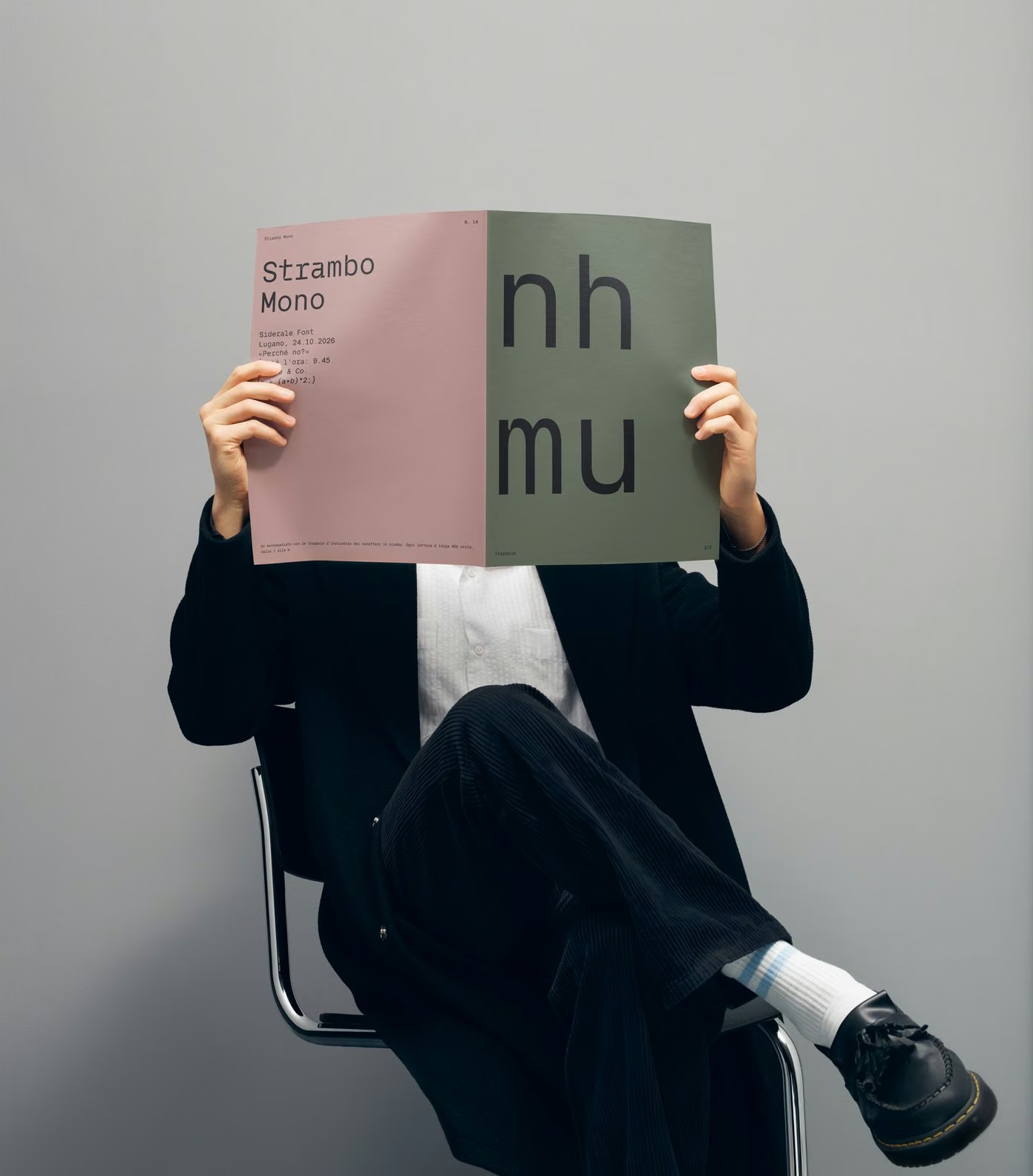
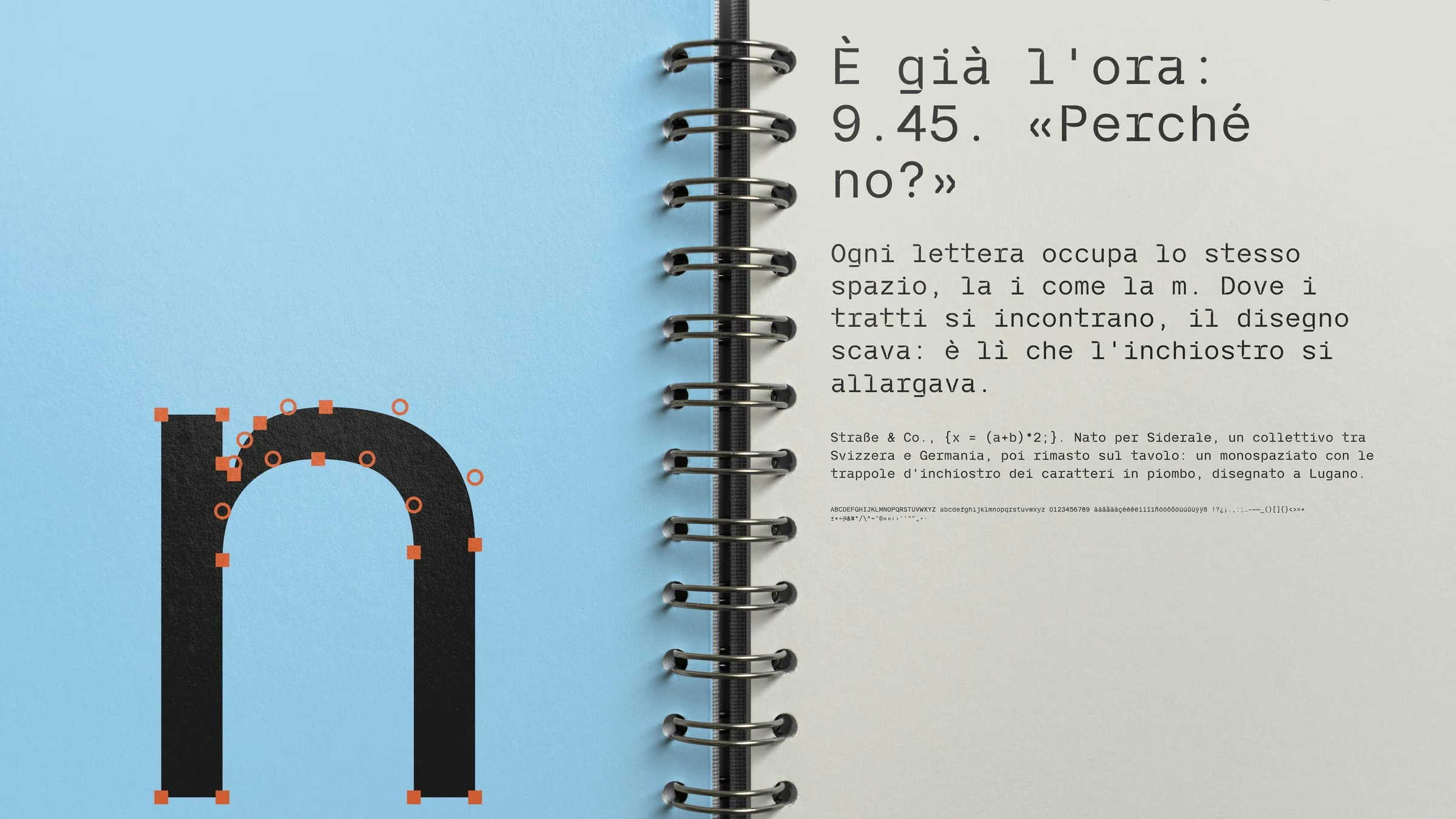
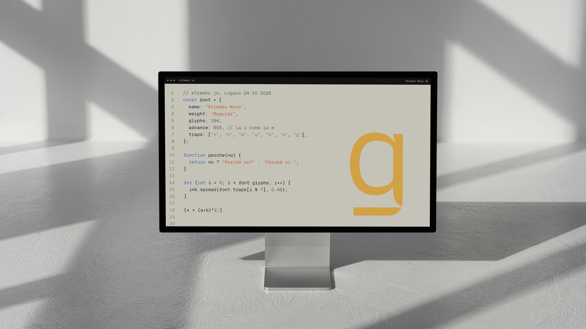
Strambo means strange in Italian, and the name is a fair warning. Strambo Mono started as the typeface for Siderale and never left the desk. It is a monospace, so every letter is 600 units wide, the skinny i as much as the chubby m, and where the strokes meet, the drawing digs in: the ink traps of lead type, cut deep enough to become the character of the font. One weight, 194 glyphs, drawn in Lugano, one curve at a time.
- Year
- 2026
- Type
- Monospace, Regular
- Glyphs
- 194, Latin with accents
- Services
- Type design, Specimen, Print
- Design
- Fabio Caverzasio
Strambo Mono